ShopDreamUp AI ArtDreamUp
Deviation Actions


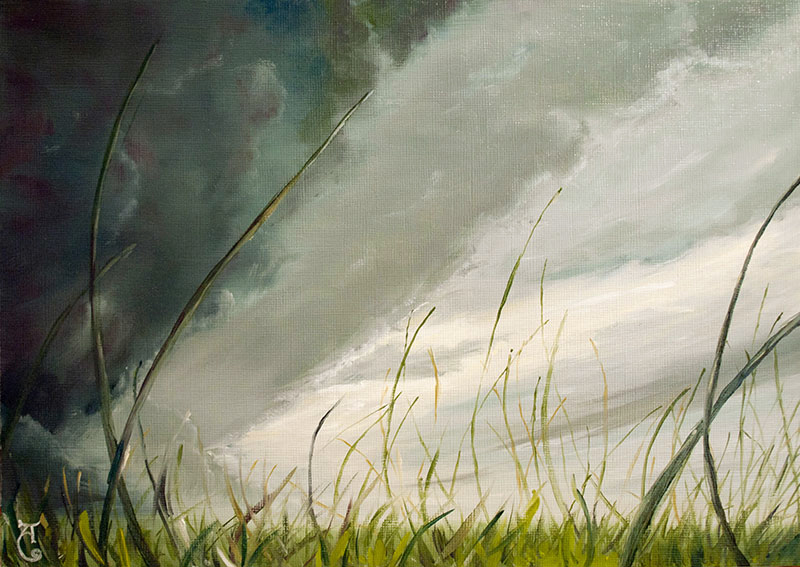
Description
New version of the old painting. Now oil on canvas.
First version in digital

First version in digital
Image size
800x567px 212.08 KB
Comments16
Join the community to add your comment. Already a deviant? Log In
Good things:
1)The dark clouds in the new version look amazingly colorful.
2) The grass has different thickness - it's good for understanding the distance between the objects and the size of the objects.
3) Very good gamma pick for the environment, you have selected beautiful colors, that fit with each other nicely.
4) One of the little rules of art is working here properly - "If you use the X color on this object, use it also on the other one". The shadow on the grass has some bordo color, which you have put on the dark cloud. I love that.
Things to work on(In MY opinion):
1) Change the width of the painting, make it much wider horizontally, the wider it is, the more sky we have and the more impact/impression you will make on a viewer.
2) Soften your brush strokes for the sky, and don't make them too big - cos' in my opinion in the original art you have lost the depth and detalization of the sky, while on the digital art it's much better. So I think you should check that out.
3) The sky looks stormy, and before storm theres a wind, that brings the wonderful fresh air. Wind. I don't see it, I don't feel it. To make it appear in your painting you need to change the position of grass and the way it folds.
I'd advice to make a long grass, that folds its tops to the but the viewer shouldn't be able to see the ground, the ground here doesn't matter for us!! What matters is the sky, wind and grass, 'cos it can give an impression of being lifted by the wind <img src="e.deviantart.net/emoticons/s/s…" width="15" height="15" alt="
Also, "cut" some grass off the pic, it's interrupting with the sky and doesn't let us to see the sky properly, imho you should make the grass shorter at the left, and to have a good length on the right. Sort of a Ying-Yang thing.
4)Make up your mind what type of grass it is. Normally grass doesn't grow too thick with some "hairs" loose. If it's long grass it will fold in several places, if its shorter one, it will be wawy when the wind blows on it. I hink the long one with little "tails" on the top would look great.
5)Thin grass on the bottom - thick on the top? You should be careful with that.
'Cos it can accidentally make the grass to look "randomly made" with fast strokes.
BUT the grass you have drawn here (with thicket top) looks like it's FOLDING towards us, so it's very very VERY GOOD! <img src="e.deviantart.net/emoticons/s/s…" width="15" height="15" alt="
I'd advice you to check different types of grass, and decide which one is perfectly fitting for your artwork.
6) The light on the grass, yes, you have it. Rule number<something>of making an impressive art "where's light - there will be darkness, where's darkness - there will be light". - The tone of the big piece of grass from the right needs more contrast - a shine, and I would add it from the left, not in the middle of it.
7)I would remove the big pieces of grass from left and right and check how will it be without it, cos I have a vision that it would look much better, more light, and will open more sky for us. Also, when it's cloudy and about to rain, sometimes the clouds pass very fast, so the crops that I have seen in the field have a gradient! They have wawe of shadow in a while, and it looks truelly wonderful <img src="e.deviantart.net/emoticons/s/s…" width="15" height="15" alt="
8) I would advise you to first practice on digital art, it's much easier and comfortable for practicing(imho) 'cos it has LAYERS. Well, and originally we don't have layers, so when we screw up - we screw up. Or you can take a big sheet and try different examples on that sheet, then you can scan it and post it as your analytical work on the painting <img src="e.deviantart.net/emoticons/s/s…" width="15" height="15" alt="
9)Basically, if you wanna add more
originality - improve the painting and name it nicely "carried with the wind" or "away,with the wind" or "away, with the sky", "alone with the wind", "waiting for the storm"sky full of lonelyness", well, I dunno, you can make one better <img src="e.deviantart.net/emoticons/s/s…" width="15" height="15" alt="
Vision - detalization, size, contrast at needed parts, shape.
Technique - proper strokes in the proper place, proper vision of nature and representation of it. (Since your artwork is supposed to be realistical)
Impact - The arrangement of all the things I've discussed before can improve the impact of the picture, how you place the grass, what kind of grass it is, how it oves.. You can also add philosophy, symbolism and your own feelings to the description.
My personal one - "With the storm comes the water and the wind. Storm is like the problems in our life - they educate us, they feed us with knowledge, like water feeds the grass.. And push on us, like the wind pushes on the leafs. The strong ones stay, the weak ones go.. But one day all of us will go to the Great Far Away."
Gives more sense to the panting, right? <img src="e.deviantart.net/emoticons/w/w…" width="15" height="15" alt="
Here, you can even take a new name for it "The Great Far Away".
Damn, symbolism rocks my heart. x)
10) Please don't get upset by the rating I've made. I'm a very dry and critical AND SELF-critical person. I live with myself every day and It's a pain in the ass <img src="e.deviantart.net/emoticons/s/s…" width="15" height="15" alt="
I rated little cos' I don't think that your painting is finished, I see it as a try, an experiment. And I absolutely believe that you can make it better, 'cos I see you can make it better, the strokes, the gamma are very good! We have a very good beginning over here <img src="e.deviantart.net/emoticons/s/s…" width="15" height="15" alt="
If you need more advice or help, if you have ANY kind of questions please contact me privately and we can speak about everything.
Wish you the best at improving your work. You can do it! <img src="e.deviantart.net/emoticons/s/s…" width="15" height="15" alt="